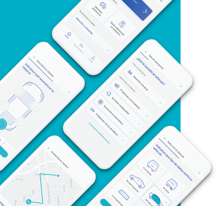
UX in emergency situations
Project summary

Team
Duration
Delivery
Sprint type
Applied methodologies
The Challenge
The main challenge was to put ourselves in the shoes of a user who will use the platform in very high stress situations, such as reporting a claim or asking for assistance when having a problem with their car.
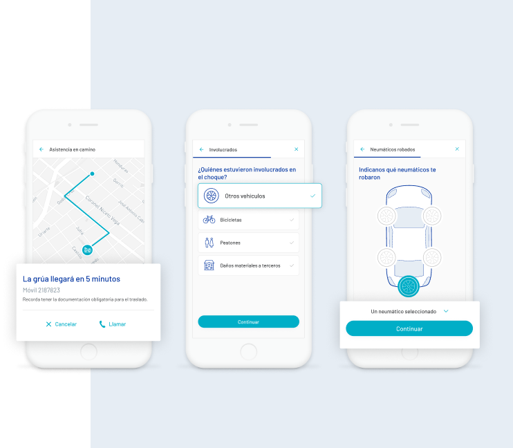
"From the beggining of the project we spoke with different areas of the company to understand the needs of those who fisrt contact with the user, identifying that the self-management of the insurance from the app would improve the visibility of the status and reduce waiting times."

Main take aways
The importance of making the status of the processes visible to give the user peace of mind with their emergency.
The user of appropriate illustration at each stage of the process reduces cognitive load for users.
The more control we give to the user for self-management, the less operational burden the customer service sector has.
The importance of streamlining the understanding of highly technical terminology with complementary information for the user.
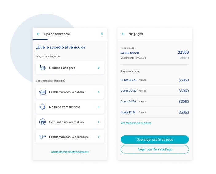
We designed the app with a focus on transmitting confidence and security to the users, who were used to make this petitions through phone for many years.

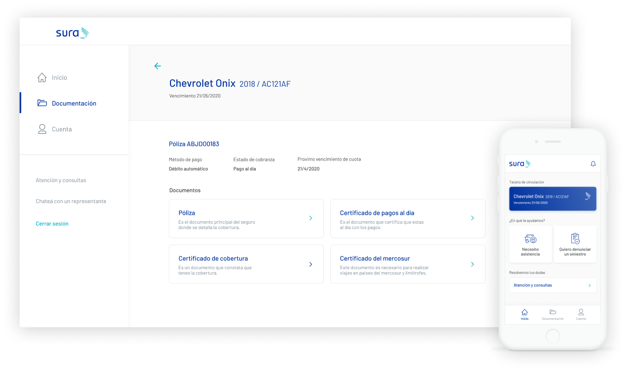
Aerolab has an exemplary team of work. They allowed us to build a product with great potential, with an outstanding focus on the needs of our insured clients

Successful User Tests
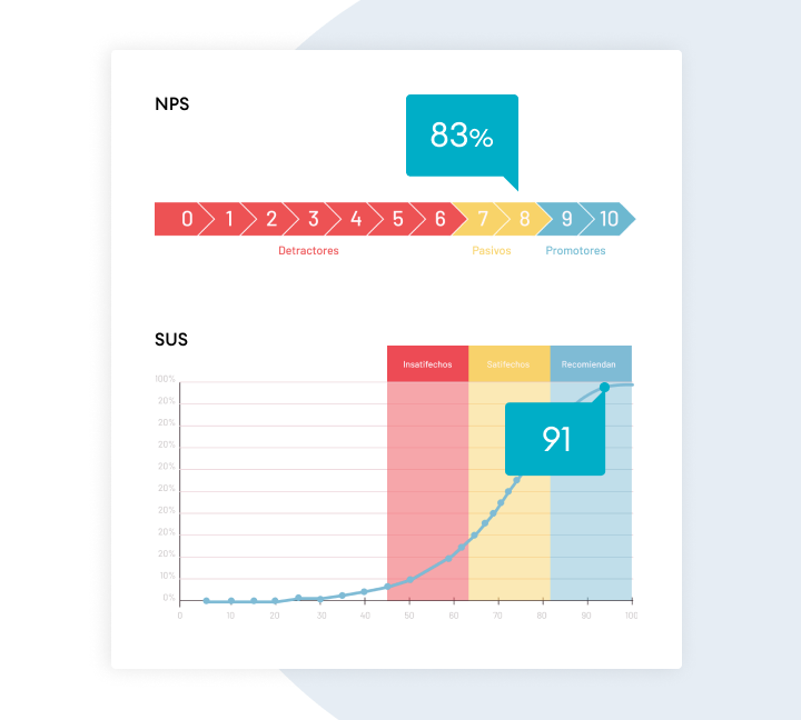
Due to the flows’ complexity, we decided to test the app during the early wireframing stage. We were able to validate our hypothesis and identify pain-points, which allowed us to enhance the experience in the UI phase.
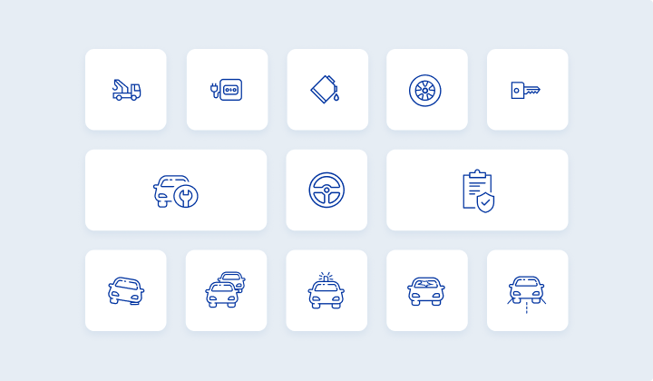
Custom Icons and Illustrations
We designed a system for icons and illustrations, which made the app a unique product and provided the user a more pleasant experience.
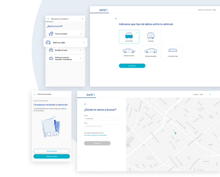
We started with a very large Design System that challenged us to make the graphic identity of the UI unique, while still being part of the system and with the ability to be scalable

