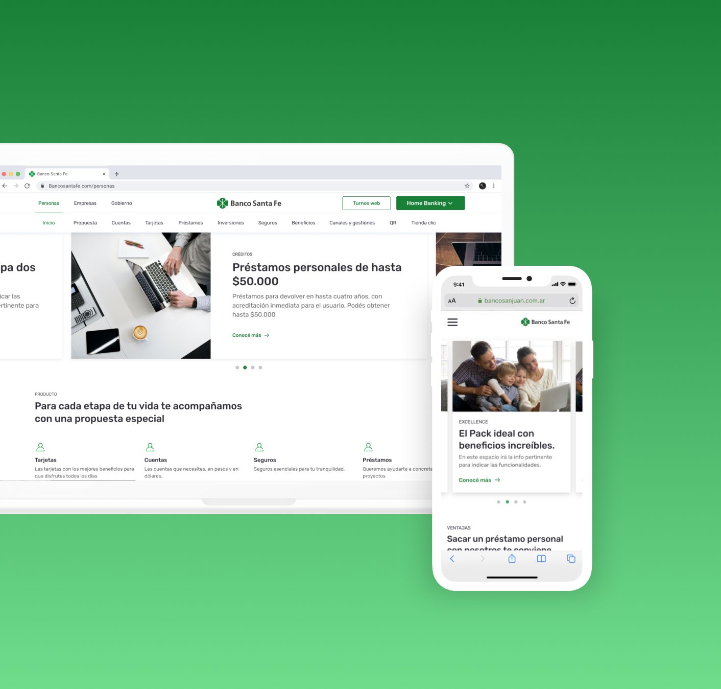
One Design System four banks
Project summary
Team
Duration
Deliverables
Tools applied
Applied methodologies
The Challenge
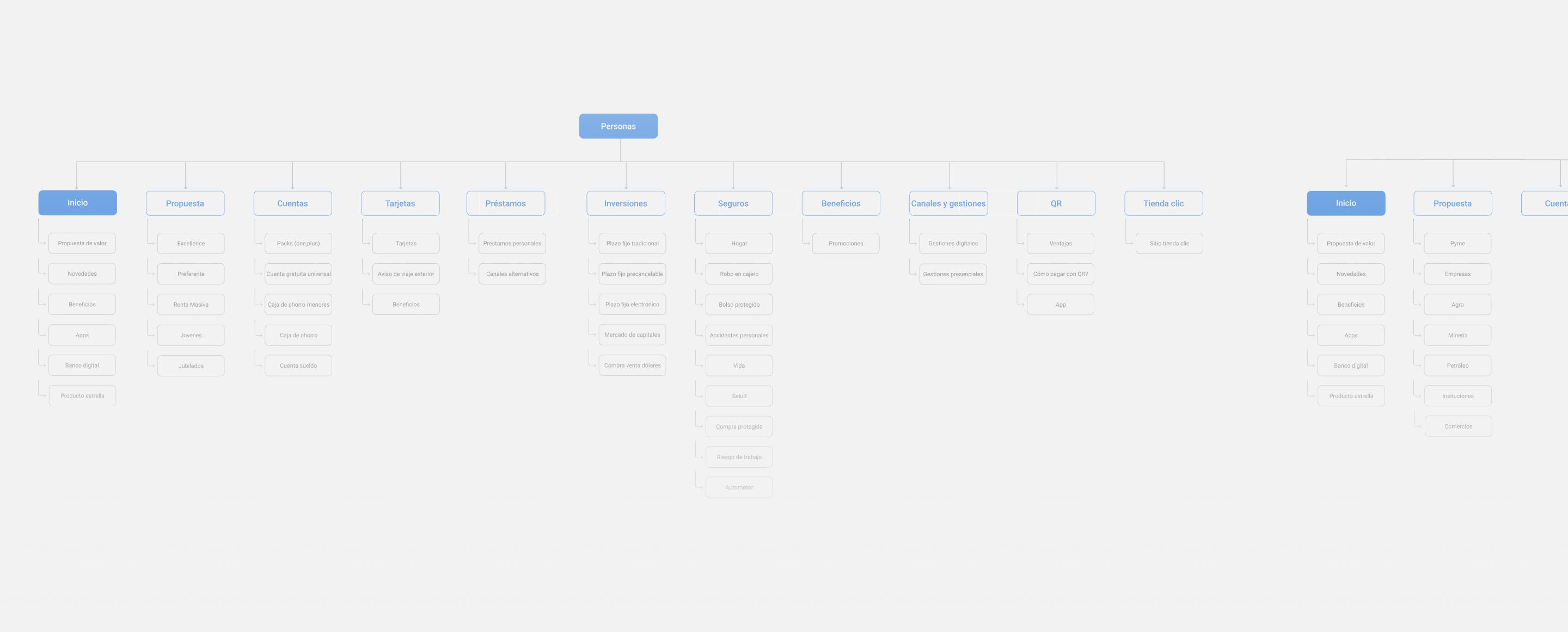
We had the great challenge of achieving a modular and scalable design, and a system that would manage the content of the four banks, in an easy and flexible way, building a library of components to cover the needs of all products and services.
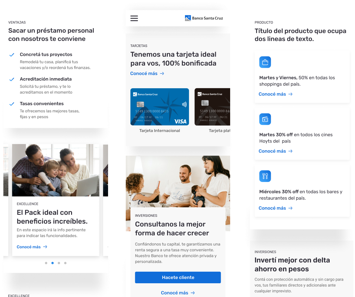
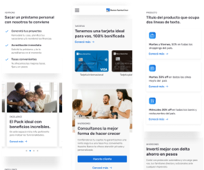
It was challenging to create a graphic system that allows scalability and application in all four banks. Working together with teams from different areas of the Petersen Group was key to understand different points of view on problems and allowed us to explore possible solutions to generate an intuitive product that reflects the needs of both the business and its users

Main Take aways
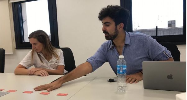
The key aspects of a neat sync between teams. Focus on division of responsibilities, organisation of tasks through milestones and flexibility to adapt to customer needs.
Having a mitigation plan and a critical path analysis.
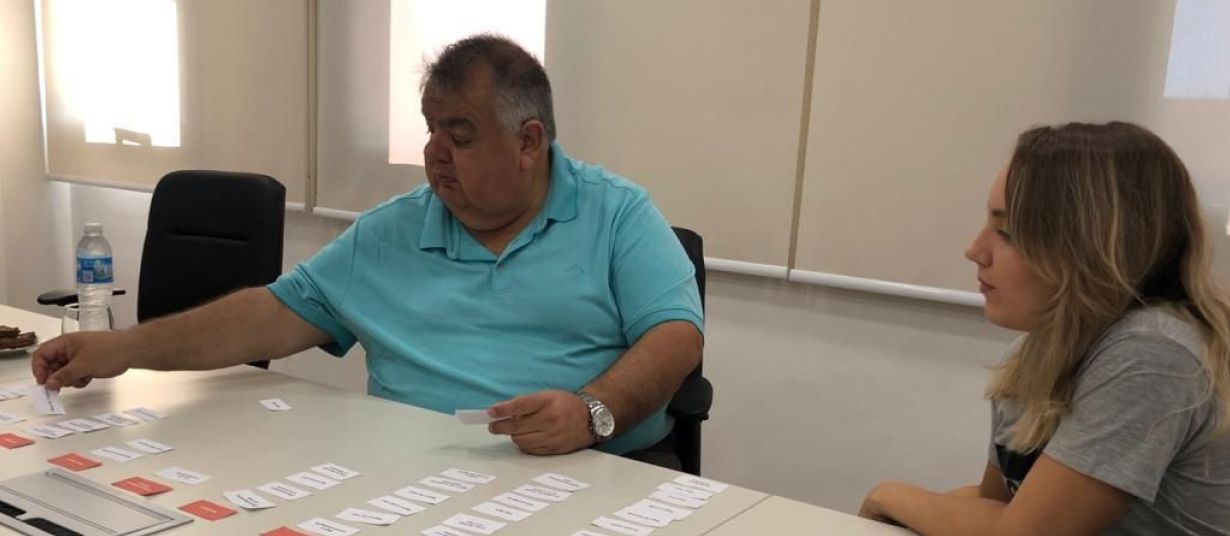
Being a large team we had the flexibility and optimal synchronization to adapt to the processes and needs of the client and work together with multiple teams from totally different disciplines

The results
We improved up to 50% the loading and navigation speed through Server Side Rendering and different optimization practices.
Fast and agile process of modification, approval and publication of content through a headless CMS such as Contentful.
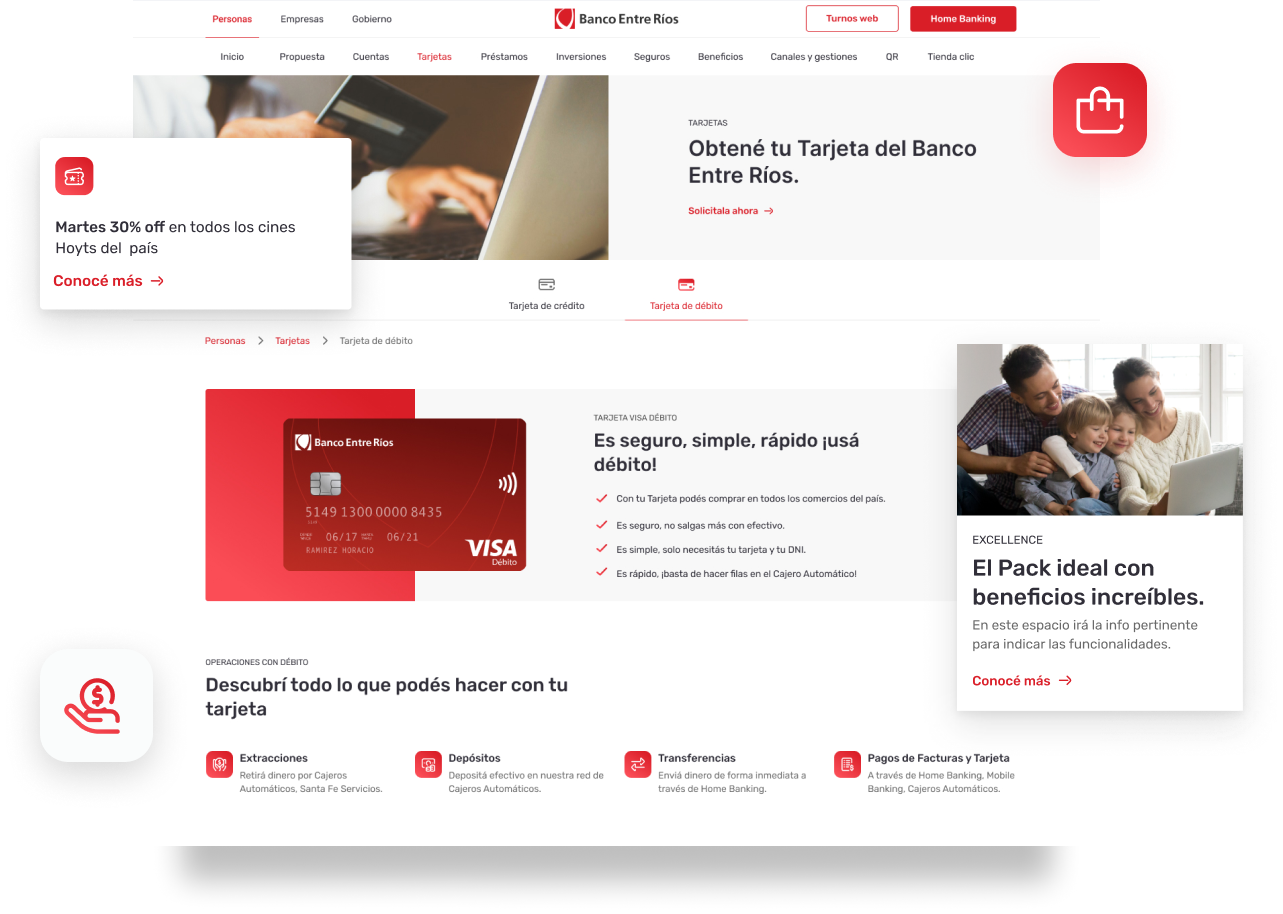
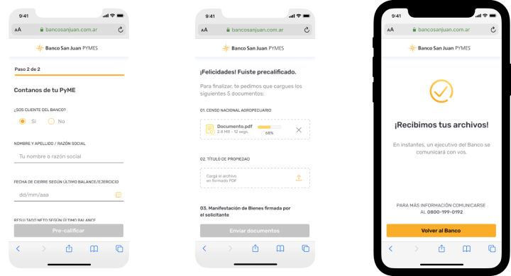
To achieve a hierarchical visualization of all the products offered by the bank, components were designed to show the relevant information to the user in an attractive way.

At GP we always seek to provide the best customer experience. We worked with Aerolab with the most demanding levels of quality and it was an overcoming experience

