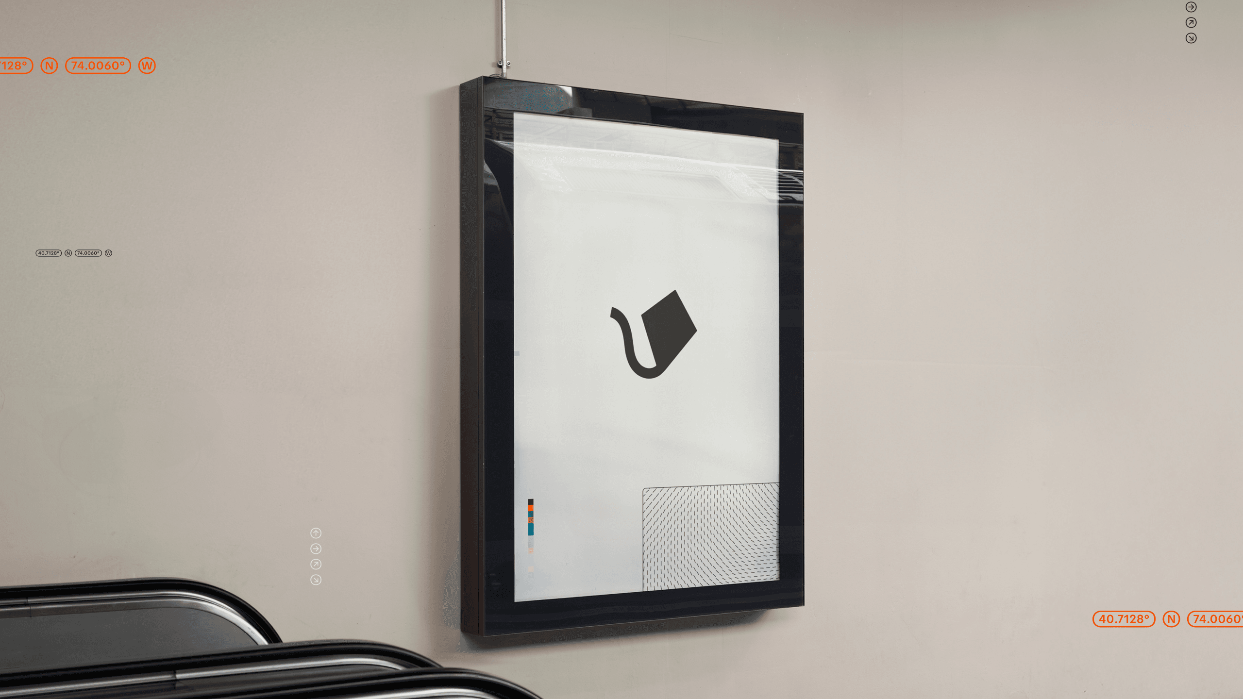
Rebranding Insights: Strategies for Bold Growth

Branding is evolving faster than ever. As AI-generated designs flood our screens, trends blur into a sea of sameness, and brands chase polished yet predictable aesthetics, it’s harder than ever to stand out. The challenge? Finding ways to stay relevant without losing what makes your brand unique.
We’re seeing both creativity and homogeneity rise simultaneously. Millennial minimalism, once a groundbreaking aesthetic, has become ubiquitous. Amid this noise, standing out means embracing intentional, authentic differentiation.
At Aerolab, we saw this landscape shift as an invitation—not just to refresh our visuals but to redefine who we are and where we’re headed. This was more than a surface-level update; it was a bold move to align our identity with the caliber of work we create and envision.
Know Why You Need a Rebrand
The timing couldn’t have been more fitting. With the launch of our branding department, we knew our own identity had to be ready to lead by example. The mission? Elevate our voice and visuals without sacrificing the heart of Aerolab, where tech meets human warmth.
“Updating the brand was about more than just visuals, it was about leveling up to match Aerolab’s evolution and identity.”
Keep Track: What Changed and What Didn’t
- Refining, Not Reinventing:The process was about recovering and elevating rather than starting from scratch. The iconic logo? Minimal tweaks. The Kite? Still unmistakably Aerolab.
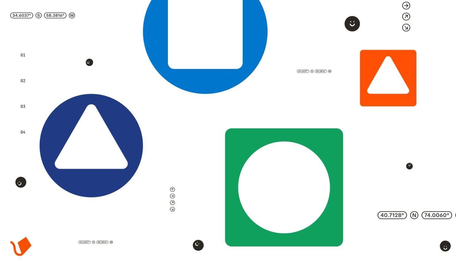
- Sharper Visual Language:The brand’s visual identity became more sophisticated and intentional. With a meticulously crafted grid system, fresh typography, and a refined color scheme, the design now strikes a balance between playful creativity and rigorous craftsmanship.
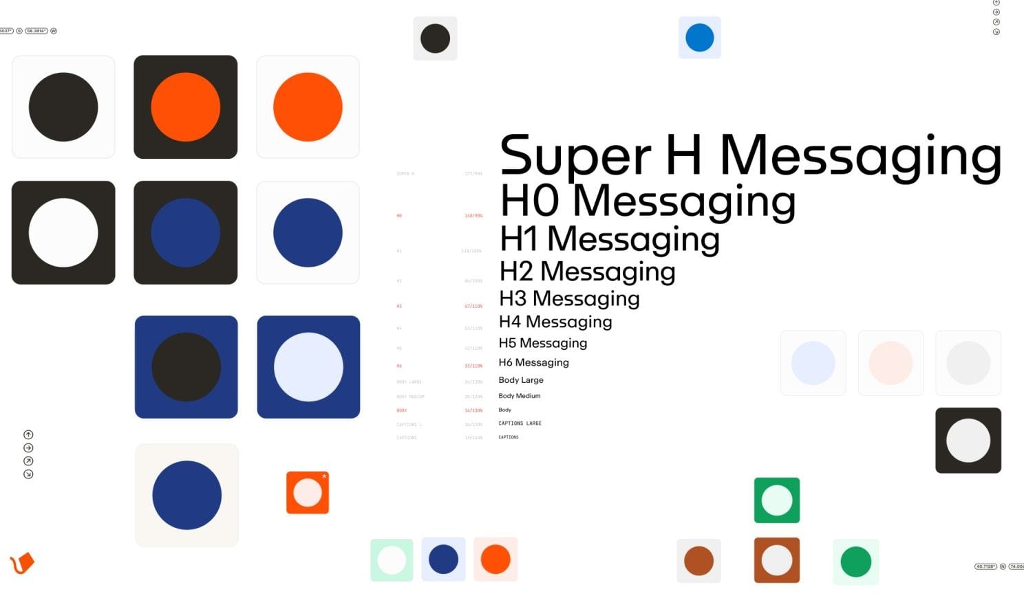
- A Bolder Voice:We wanted a voice that felt daring yet approachable. The evolved tone speaks with clarity and confidence, embodying Aerolab’s DNA—clever, human, and forward-thinking.
- Unlikely Inspirations:Creative references came from unexpected sources—architecture, modern art, editorial layouts—resulting in a system that feels both timeless and evolved.
Industry context: A State of Play
Aerolab’s rebranding journey stands as a counterpoint, proof that thoughtful design, storytelling, and identity matter more than fleeting trends.
- The Age of Seamlessness:With so many designs blending into one another, brands have an opportunity to step away from the predictable and build bold, recognizable identities.
- Finding Purpose:Consumers today value authenticity. A strong, coherent brand story that goes beyond aesthetics drives lasting connections.
- The Power of Craft:In a world dominated by AI shortcuts, craftsmanship and intentionality stand out as differentiators.

Directors’ Cut: Design Deep Dive
“The graphic resources and the concept behind it are as much about storytelling as they are about design.”
Every decision, from grid systems to the subtle implementation of golden ratios, was deliberate, creating a seamless narrative across all brand touchpoints.

Final Thoughts
This rebrand is a statement of intent, a commitment to growth, creativity, and authenticity.
We hope our journey sparks ideas for studios, brands, and creators looking to elevate what makes them unique. Whether you’re planning your next big move or just seeking inspiration, remember: refinement often beats reinvention.
What challenges could your brand face during a rebrand? Share your thoughts with us!