Changing the way people add (groceries) to cart, for LATAM’s most premium brand

shopping bag with vegetables

Transforming Tottus’s problematic grocery e-commerce shop into the group’s best performing store, increasing market share by more than 50%.


what we did

Research
Design
Development
User Testing

platforms

Web
iOS
Android
Ecommerce
Client shopping

Meet tottus

Falabella is one of the largest retail and financial services companies in Latin America, with more than 500 retail locations across Latin America.Tottus is their flagship supermarket chain, focused on quality and a premium in-store experience. Unfortunately their online grocery delivery was not cutting the mustard.

The challenge

What we were up against

The existing online shopping experience was mired in technical issues, and while customers were “adding to cart” they weren’t completing orders. We needed to elevate it to the level of their in-store experience — and do it across two different countries. This was critical in a market where grocery delivery is growing fast, with competitors that could quickly steal away customers.

People working
the strategy

Creating cohesion across complex teams

This massive project involved the Tech, Design, Marketing and Logistics teams in order to deliver a truly great shopping experience.

Building Back Trust

The first thing that stood out during discovery is that most customers that bought online never came back.

Not only that, a ton of customers that went through the entire shopping process would abandon their cart right before payment. After talking to them, we quickly realized that these customers did not trust the site.

All these issues were losing Tottus more than 70% of their long-term customers.

  • Warning icon

    No indication that products were replaced or not available.

  • Clock counter wise icon

    There were no updates on order status or changes.

  • Question mark icon

    Nowhere to input preferences (like choosing how ripe they wanted their bananas).

Designing for trust

There’s nothing worse than placing an order than getting a call saying “We don’t have that in stock.”To avoid any more awkward calls or half-delivered orders, we designed the UX with the Stock and Logistics teams to ensure every item ordered was an item on the shelf.Every online shopping trip starts by asking for a customer’s location, ensuring every single thing on the screen matches the in-store stock. We also created graceful ways to replace items, especially for products that frequently went out of stock.

Screenshot of Tottus appScreenshot of Tottus app
Fruit image

This massively reduced customer complaints and cart abandonment. Giving customers back the confidence to do their weekly shopping using the app.

Promos are a Go Go

Supermarkets and promotions go together like peanut butter and jelly. One of our goals was to give the marketing team control over all content so they could add coupons, new campaigns, or contribute to the new recipes section.To keep it easy, we created a modular design system so new pages and assets could be published in a minute while maintaining the site’s design and functionality.

Screenshot of Tottus app
Screenshot of Tottus appScreenshot of Tottus appScreenshot of Tottus app
Screenshot of Tottus appScreenshot of Tottus app

As good online as it is in store

As it turns out, most of the internal issues were related to last-minute copy and pricing changes, which were handled by a complex ticketing process owned by the Engineering team.

Annoyed by this process, the Marketing team ended up editing copy on the site via Google Tag Manager. Which is as creative as it is horrifying.So we scrapped that process and created a new CMS that let the Marketing teams write, preview, schedule, review and publish all pricing, promotions and copy without going through the Engineering team at all.By building accessible tools, we were able to streamline systems and prevent inventory errors — without any of the red tape.

App screens

Building a headlessinfrastructure

If we wanted the new UX to work across a multitude of systems, it was necessary to migrate to a headless ecommerce infrastructure to stay agile.We ended up choosing CommerceTools, an API-first ecommerce platform that could easily be integrated with Tottus’s systems, as well as Contentful, a great CMS for helping manage content across all their products.By tying all this together with Typescript, React, Next.JS, and a handful of APIs coupled with a CDN, we were able to ship a blazing fast architecture that could handle all their stock and logistics complexity in a few milliseconds, helping create a great customer experience.

What happened next

The #1 store

The site and app quickly became Tottus’s best performing stores.

Happy users

Frustrated users and abandoned carts became a thing of the past.

Sales are up

With its new digital-first strategy, Tottus increased market share by more than 50%.

Johan Bergström's profile picture
Johan Bergström

Tech Consultant for Falabella Labs

Tottus

"Aerolab's talent for creating compelling user experiences that drive conversion is unparalleled. They helped transform a complex eCommerce experience into an intuitive interface that was both beautiful and easy to use."

Then we tackledpayments

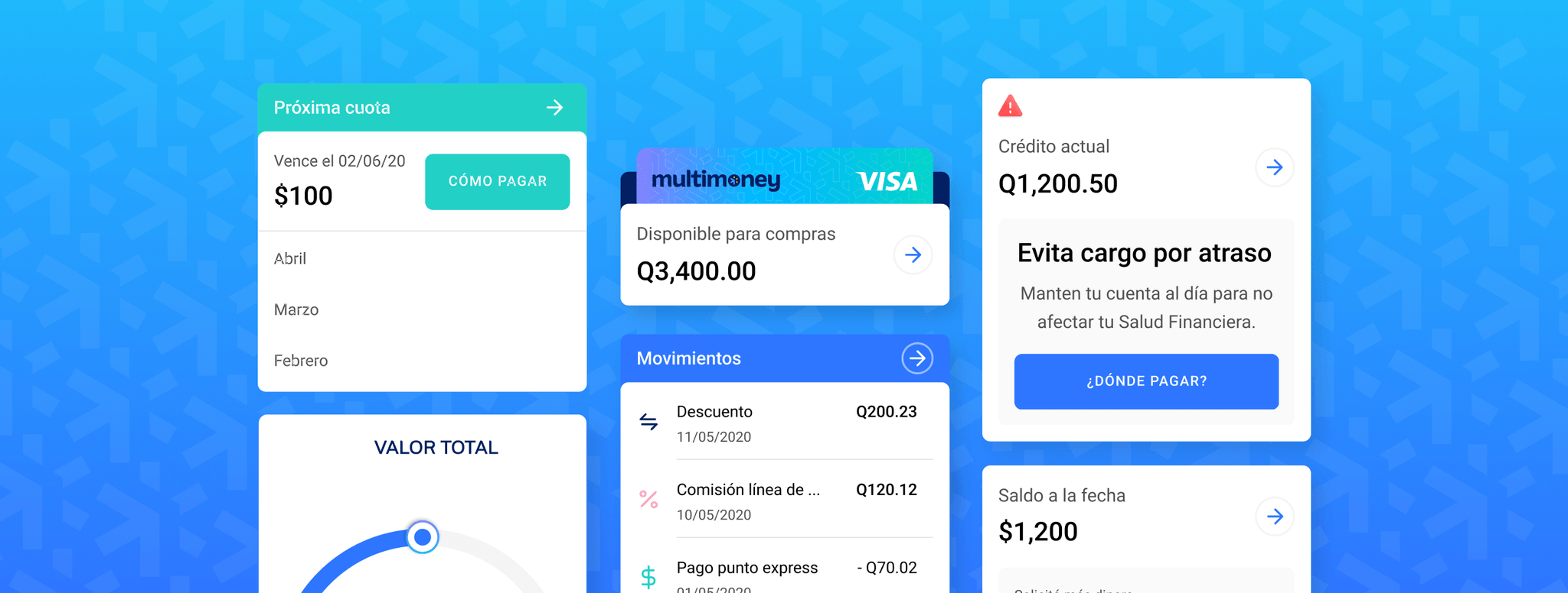
Soon after launching Tottus, we started working on FPay, a wallet from the Falabella group focused on fast peer-to-peer payments.By taking advantage of their massive retail presence, we were able to quickly build an app featured in-store to millions of customers. A helpful tool for all, a perfect brand move for Falabella.

Screenshot of Tottus app
Emilio Fallau's profile picture
Emilio Fallau

Manager of TI Digital Payments

FPay

"I'm impressed with how Aerolab has helped level up our team with their design and engineering expertise. Their skill has been key in helping make this project a success."