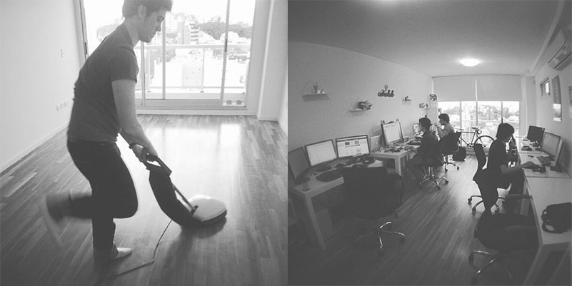
Working on oneself is always the biggest challenge, yet rewarding. It was exciting: in addition to the usual hard work of exploration, we came face to face with our own strengths and weaknesses.
It was necessary to
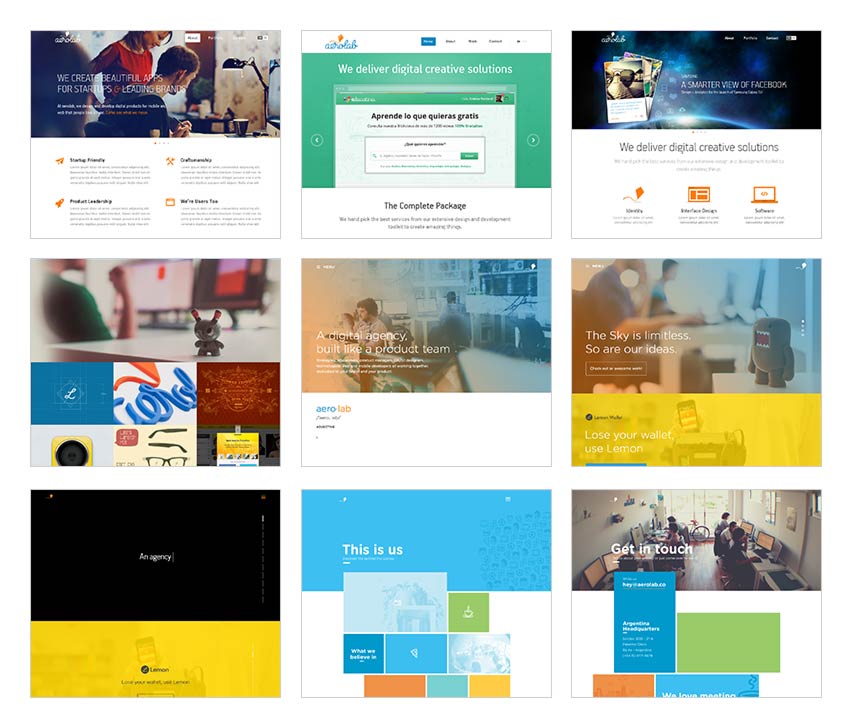
Our strategy
Translate
this growth into a visual identity
Reposition
ourselves internationally
Launch
case studies of the processes
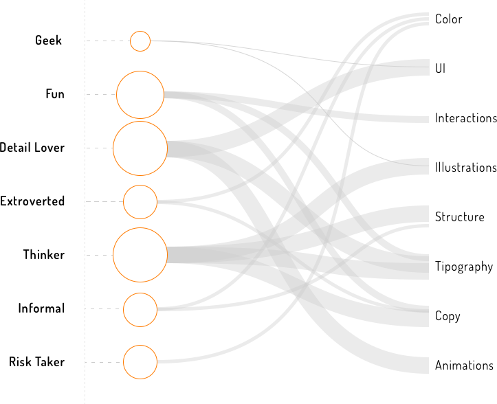
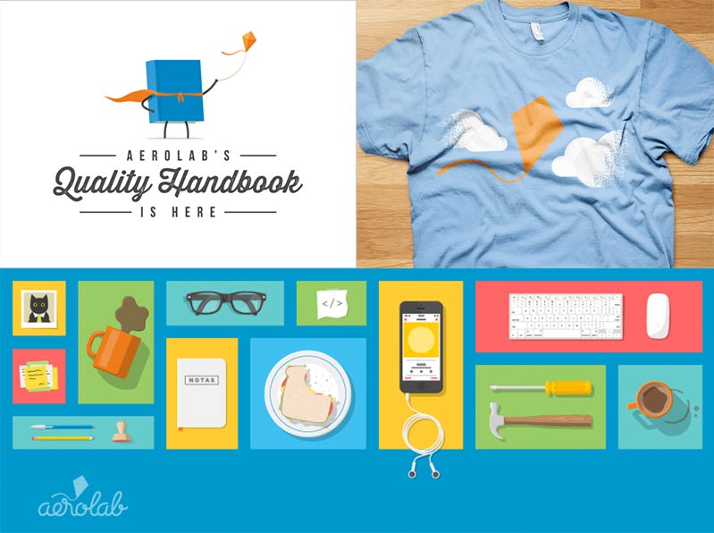
We defined our awesome Design Persona and worked on an art direction that suggested there was a message beyond the logotypes and color schemes. We looked for lists of psychological terms, and even took some personality tests to find the terms that identified us.
Branding
All of us have some salient personality traits, and others that can only be discovered by spending enough time together. We translated that concept into a graph of our Design Persona, getting a better idea of how and where Aerolab's traits would be shown in the visual identity.
Art Direction
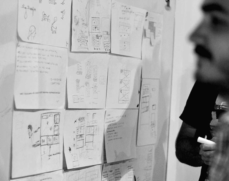
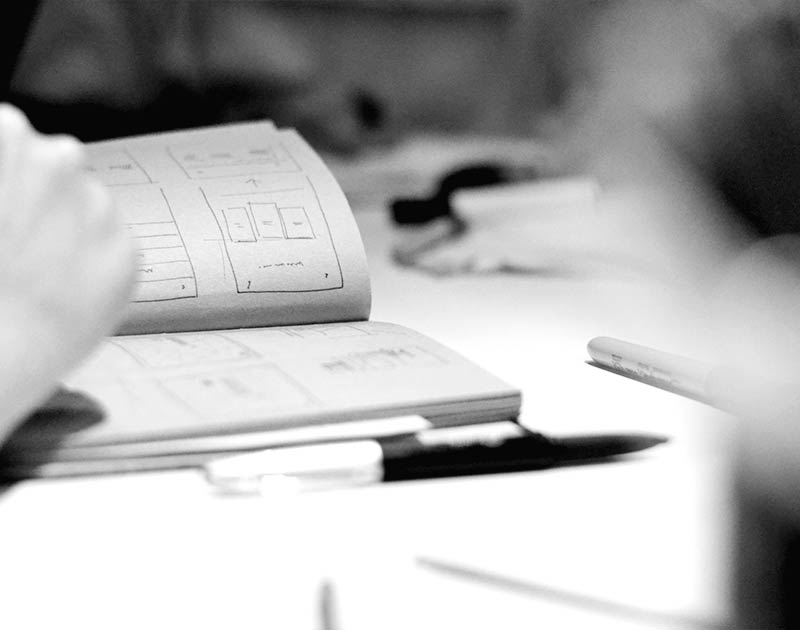
At the beginning we had a visual system with lots of different variables. It was time to make decisions, but where did we start?