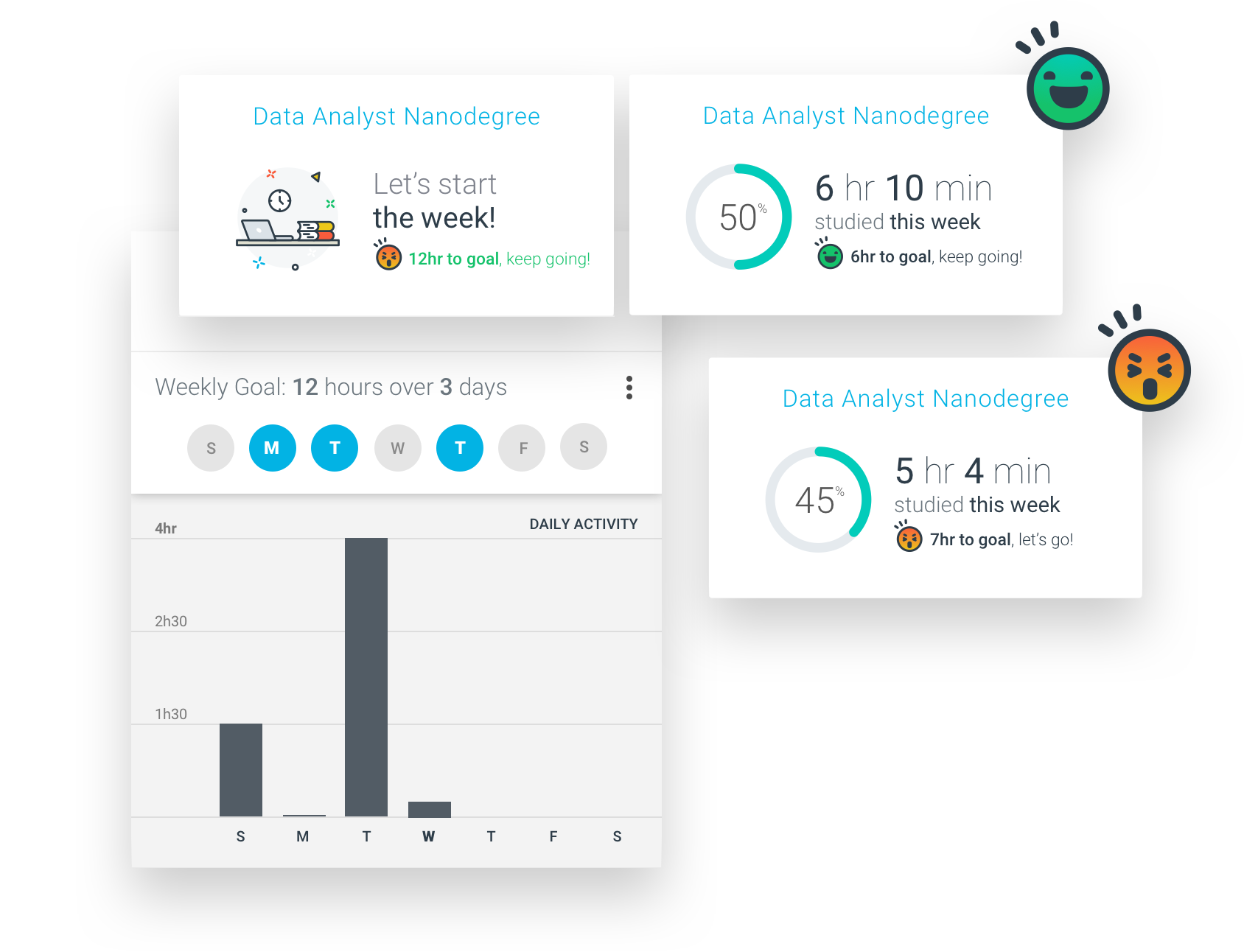
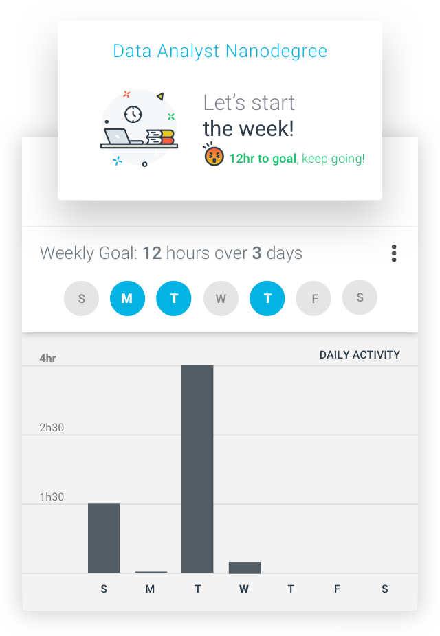
Rather than focusing on distant, complex objectives, we centered the process around bite-sized steps that would eventually add up to reaching the original goal. The whole experience was built as a way to minimize anxiety, supporting students through gentle reminders and motivational nudges along the way.
We wanted the app to adjust to the student’s needs and personalities, so we let them fine-tune how Udacity works by choosing one of four profiles, according to their routines and usual availability.
We divided the onboarding experience so that users could focus on each individual step, making sure that they paid attention to every stage and all the settings were genuinely tuned to their habits and personalities.
We crafted a set of notifications for both inside and outside of the app with everything from reminders to goal updates, with the addition of motivational messages to keep users engaged throughout the process.
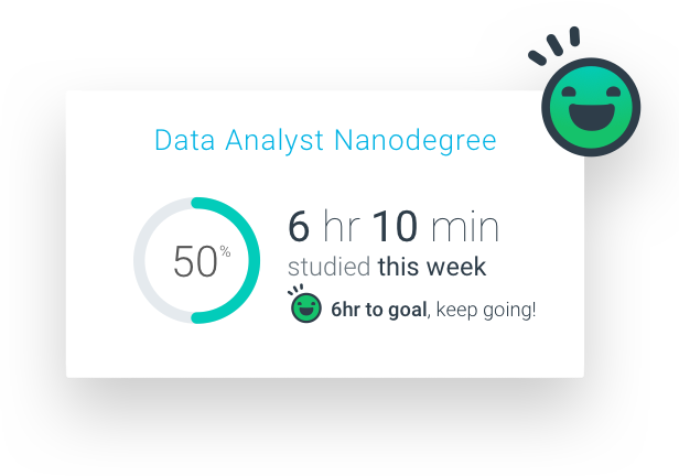
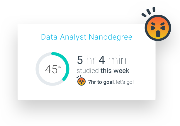
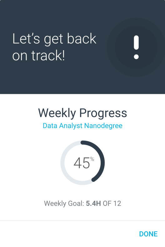
Tracking progress was key for users to visualize how they evolved through each stage and how, with every hour they put in, they came closer and closer to reaching their goals. It also served as an encouragement to build consistency.
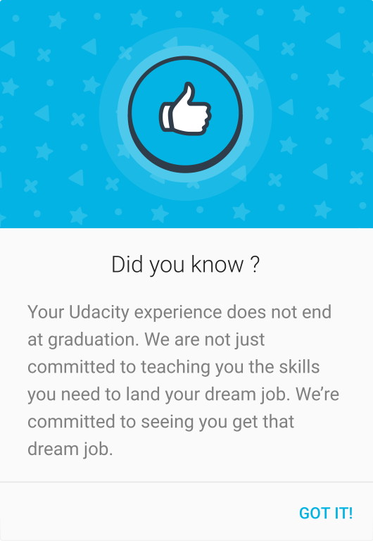
We wanted users to feel empowered and in charge of their own growth. We included several motivational facts, friendly nudges, and progress reminders throughout the app to keep things positive.
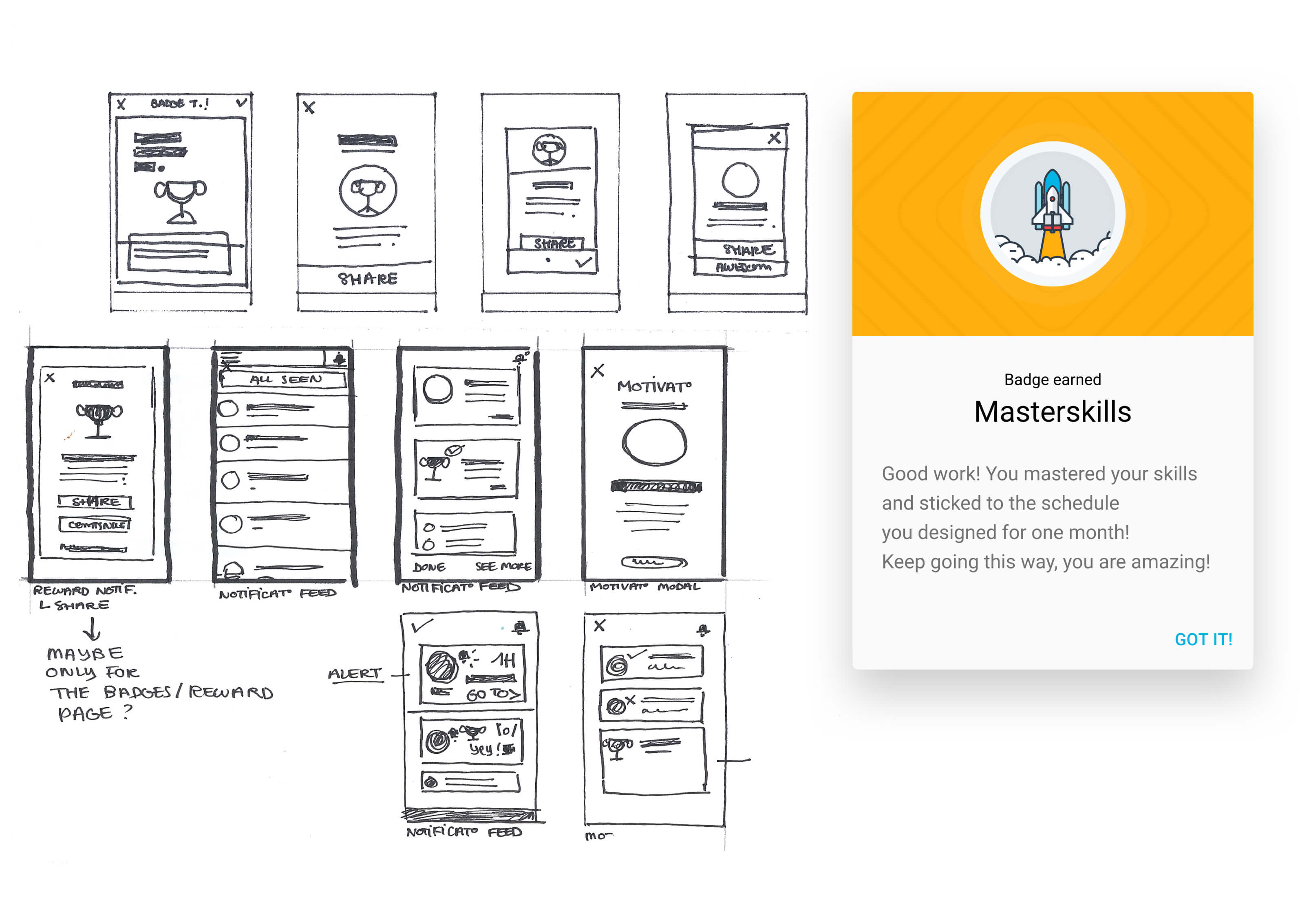
If we wanted users to keep pushing through and working for their goals, we had to find a way to make them feel good about their progress and to feel like they were constantly improving. That’s how we came up with a badges and achievements system that consistently granted new titles and reinforced the user's sense of’ progress.
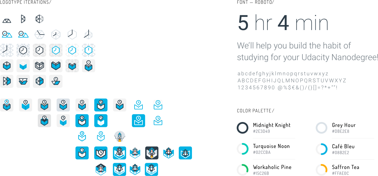
We adapted the brand identity to fit to the guidelines of Material Design, as well as those defined by Udacity itself. We created a whole new visual system that included original icons, logos, and illustrations, paired with a custom color palette and a very specific style of copywriting.