01
The_Client
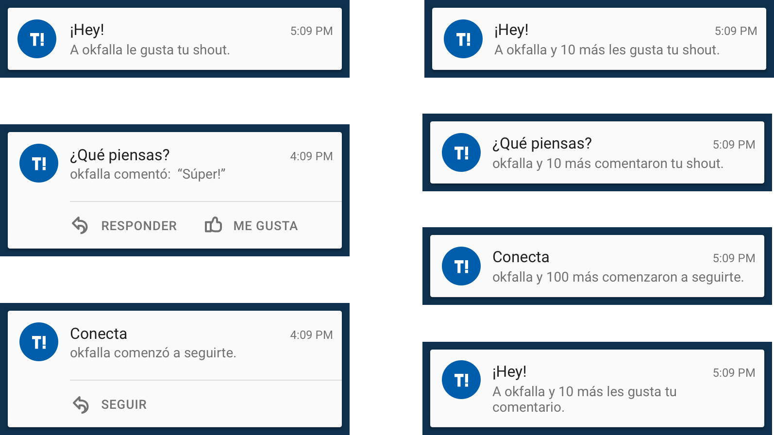
Taringa! is a virtual community in which users share all kinds of information through a collaborative system of interaction. There are 35 million unique users per month in the mobile platform alone. These users create thousands of daily posts with general interest topics, such as tutorials, life hacks, recipes, news, sports, and reviews. In addition, since 2011, the platform includes a section of microcontents called “Mi Taringa!” that has grown 350% just this year.
daily unique visitors
shouts per month
posts per month
02
The_Challenge
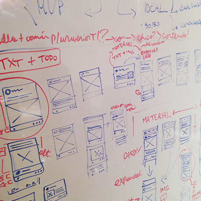
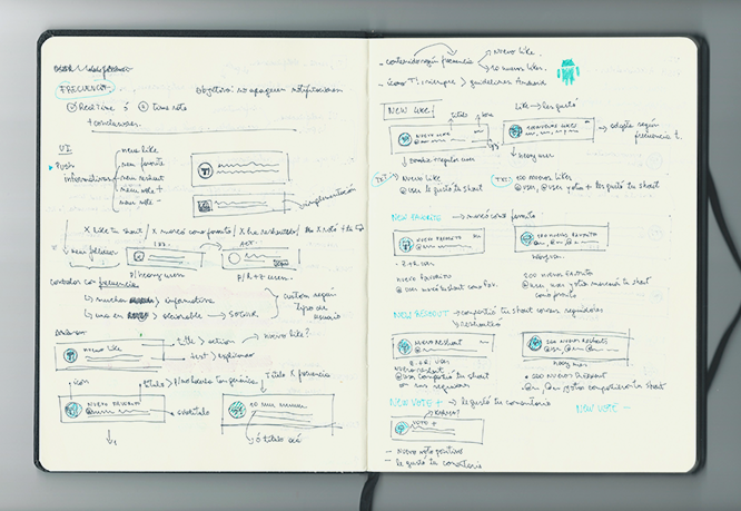
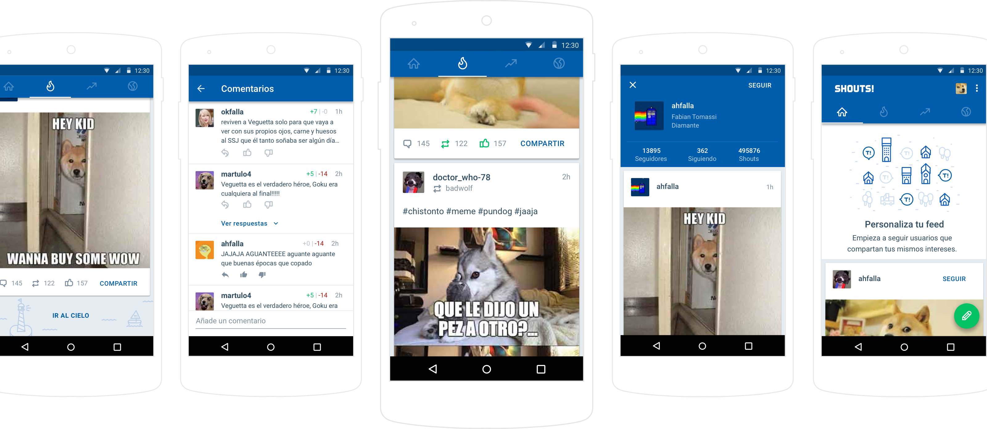
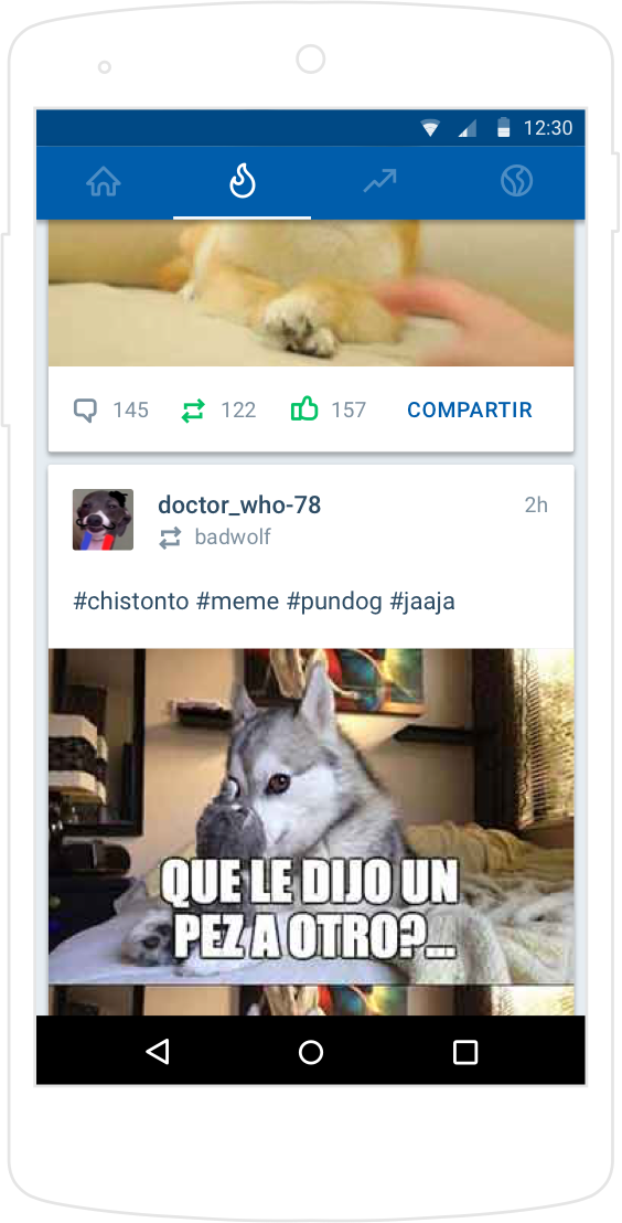
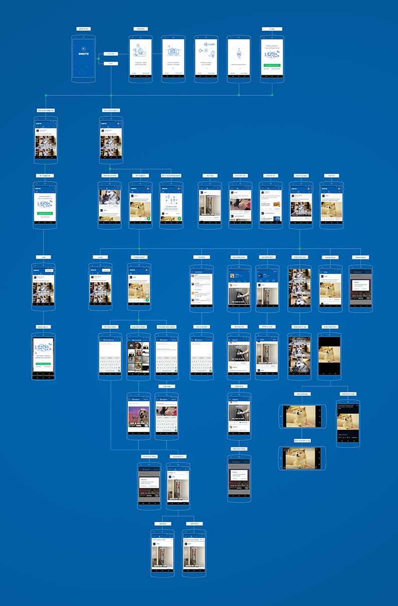
Logically, the use of microcontent made more sense on a mobile platform than in any other medium, so “Mi Taringa!” was chosen as the beginning of a strategy of mobile standalone products. Thus, they expected to penetrate the market of humor, memes, and GIFs in Spanish, a concept that was very popular worldwide but was yet to be explored in Latin America. We had to design and develop the app in only 10 weeks, helping Taringa! to position itself as the main source of entertainment in the little breaks people have when using public transportation or waiting at the doctor's office.
Taringa needed to
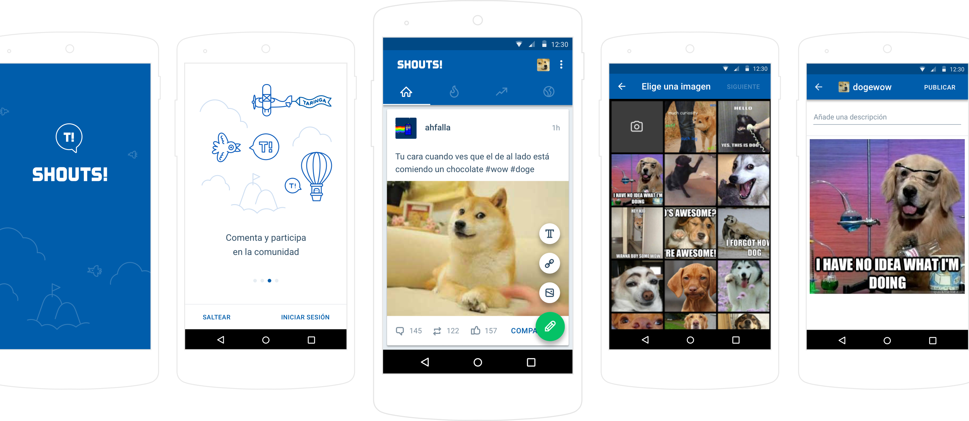
The Mobile Version Of “Mi Taringa!”
Our strategy
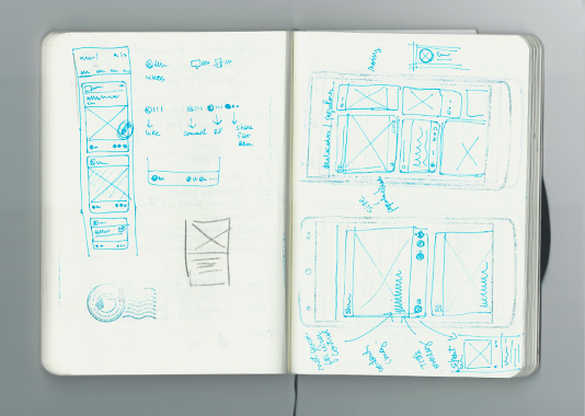
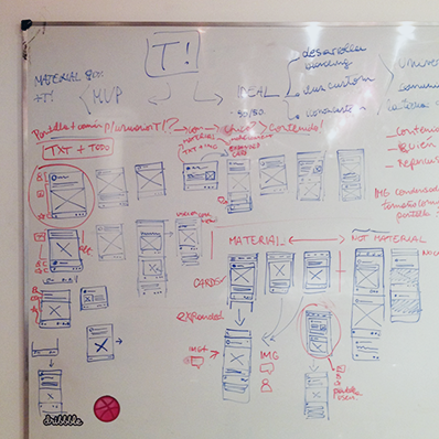
Redesign
The Visual Interface Using Material Design
&
Itself As Market Leader
Improve
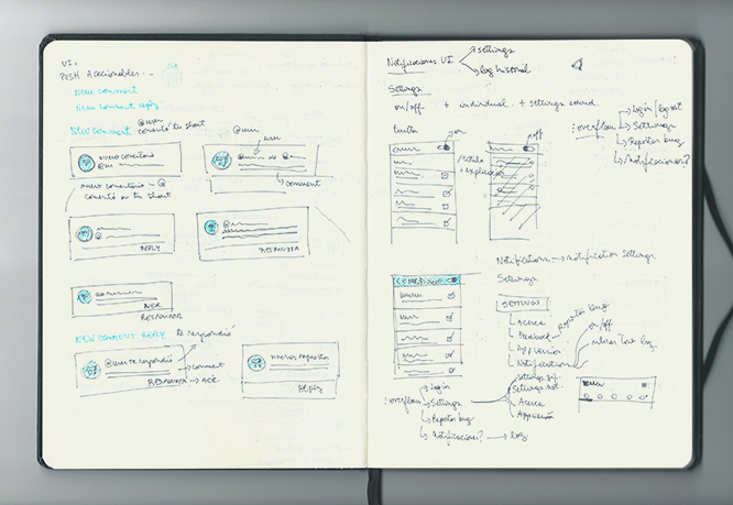
The Content Consumption Experience
Branding
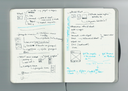
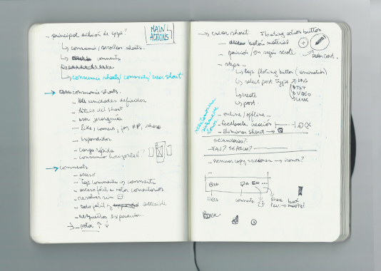
The objective was to generate an identity all of its own, to differentiate it from other sections of the platform, and to identify it as a product of Taringa! For this purpose, we used a methodology called Kapferer's Prism or Brand Identity Prism. We built experience into the app as a relationship between two people: thinking of the brand on the same level as the users, to give it a sense of interactivity and make it even more relatable.