We had to make certain adjustments and tweaks in order to convey a proper B2B image. We did as many tests as we could within the given timeframe and eventually came up with a lighter, smarter version of Jampp’s logo.
To go with the updated personality, we decided to take a look at Jampp’s former palette and came up with a couple of alternatives rooted on the wide variety of color that was present on their website.
We chose Roboto for the company’s new image because it’s a highly reliable typeface, proven to be perfectly readable in all sorts of screens and devices.
We used illustration as a friendly, clean way of communicating several of the site’s features, as well as a way of accompanying User’s throughout the platform. Deciding on a style was no easy task, but we were extremely satisfied with the end result.
We developed five style alternatives before landing on the right one for Jampp. The goal was to create a language that allowed us to share the abstract values, technical features, and concrete characteristics of the company, as well as meeting their aesthetic standards.
Due to their complexity and the way in which they were used, the platform’s ‘Icons’ turned out to be something along the lines of miniature illustrations. Their main purpose was to simplify much of the site’s technical speech and processes.
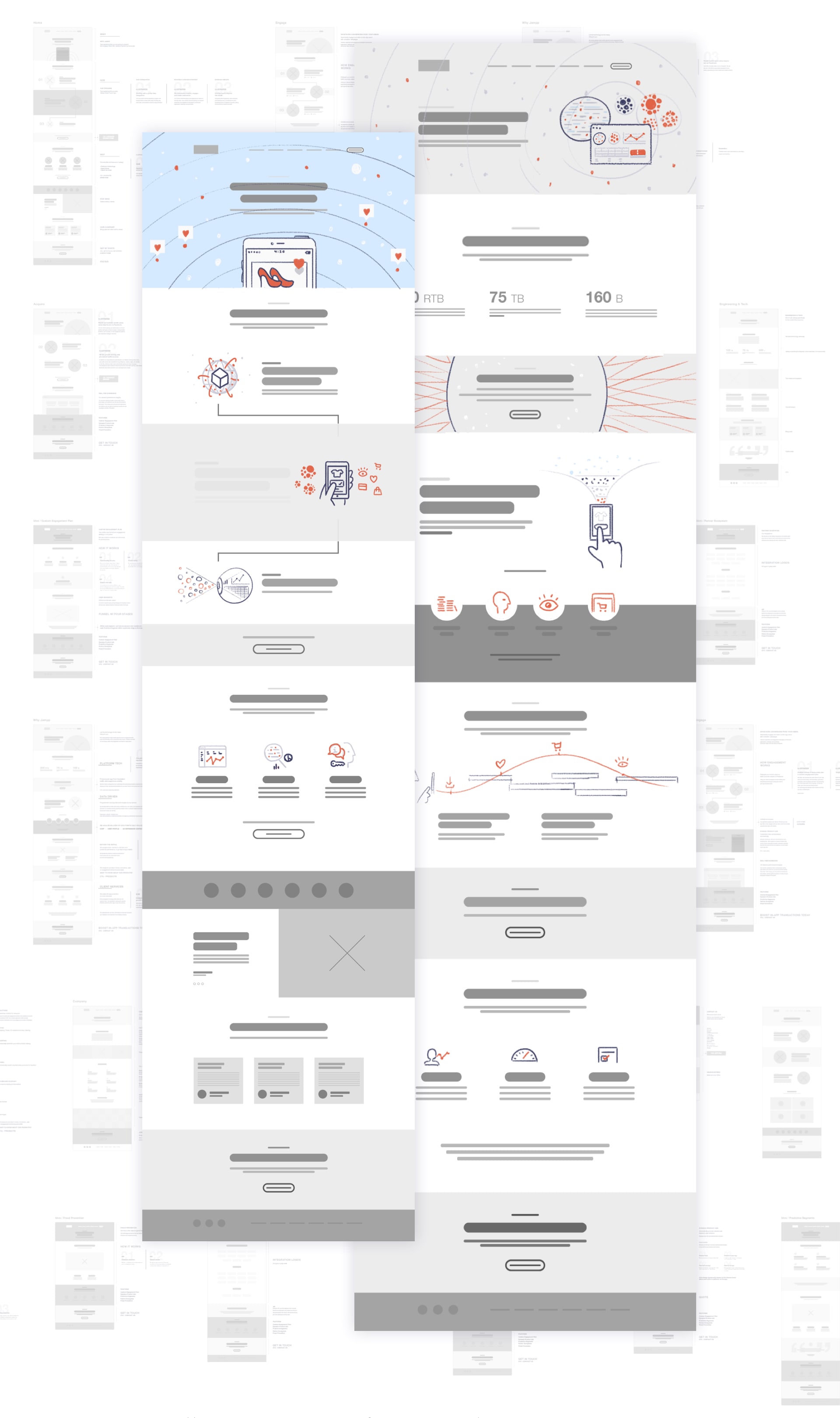
There was a ton of copy to work with. We distilled it and re-organized it to fit into more attractive content blocks that would make the site a compelling, friendly experience for users, even on mobile.
This time around we set out to give Jampp a more serious look, but one that still managed to build on the friendly spirit of the company. We accomplished this by finding the right integration between text and visual elements, as well as giving each section a defined, unique perspective that added to the overall storytelling of the site.