A better online banking experience
Building on top of the experience we created for their Mobile App, Banco Galicia approached us to improve the Web-based part of their service. You can check out the full story on our Medium publication.

Building on top of the experience we created for their Mobile App, Banco Galicia approached us to improve the Web-based part of their service. You can check out the full story on our Medium publication.
The first stage of the project was all about learning. We set out to learn all there was to know about digital products in the banking industry and how we could help out their users.
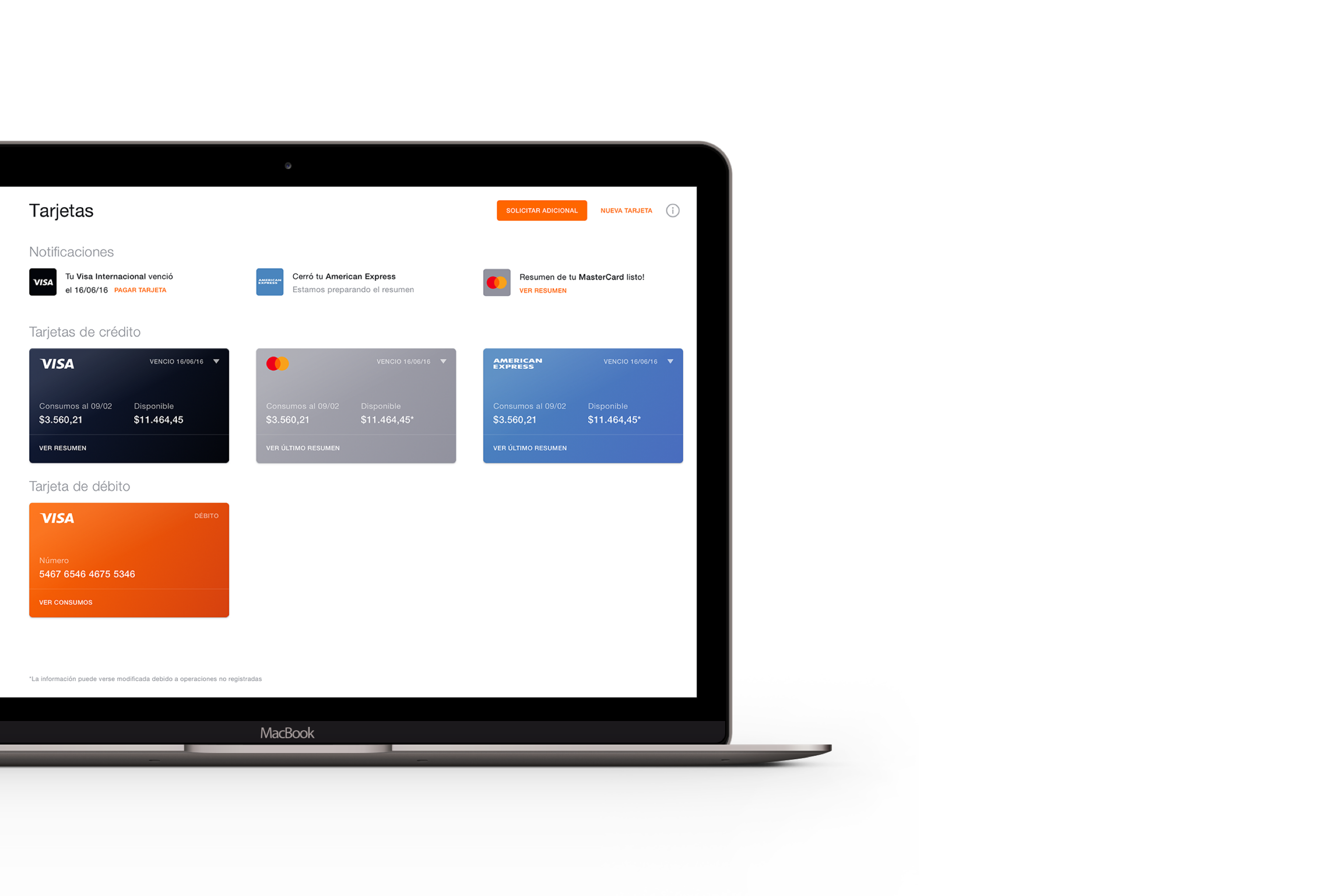
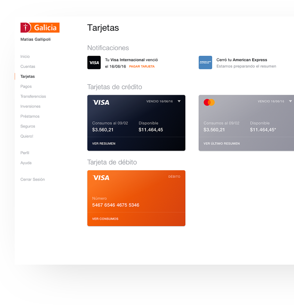
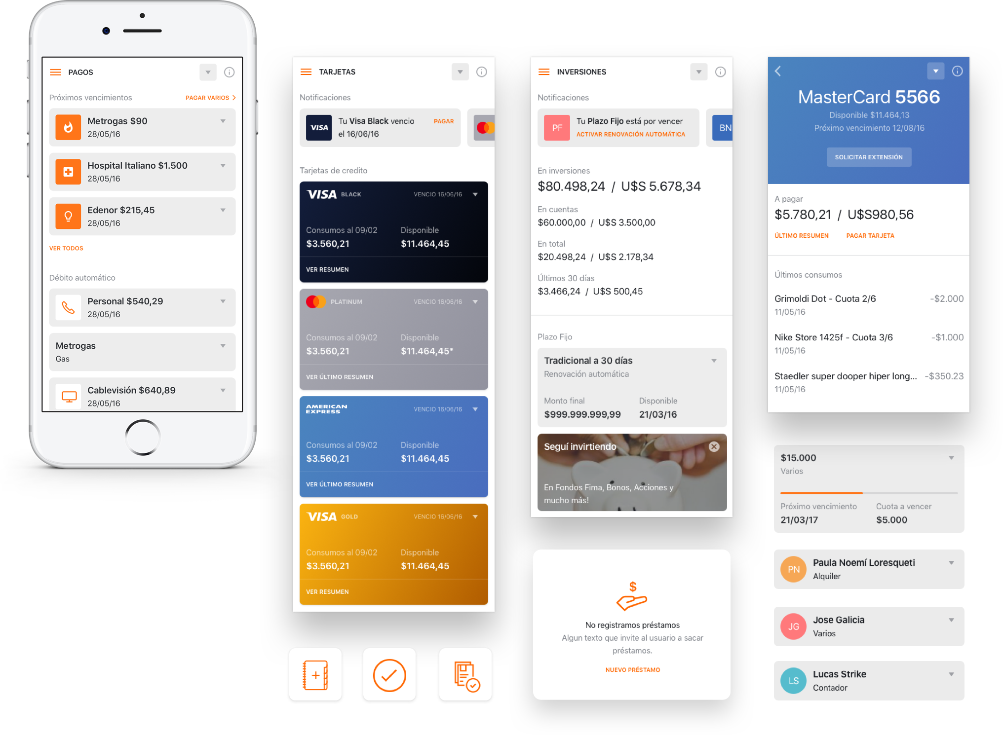
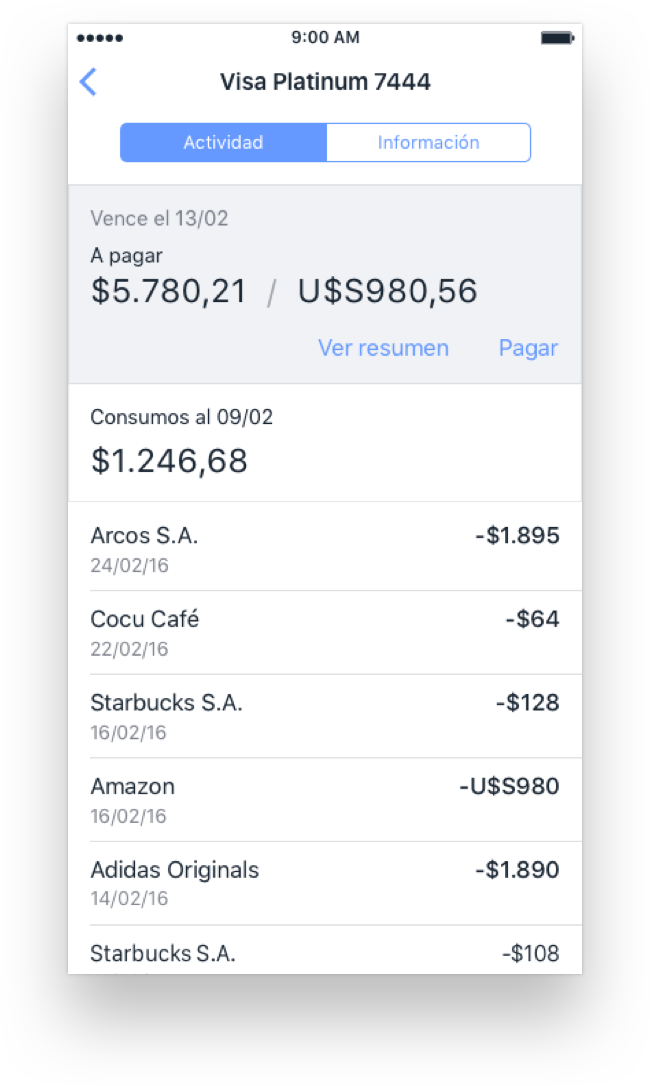
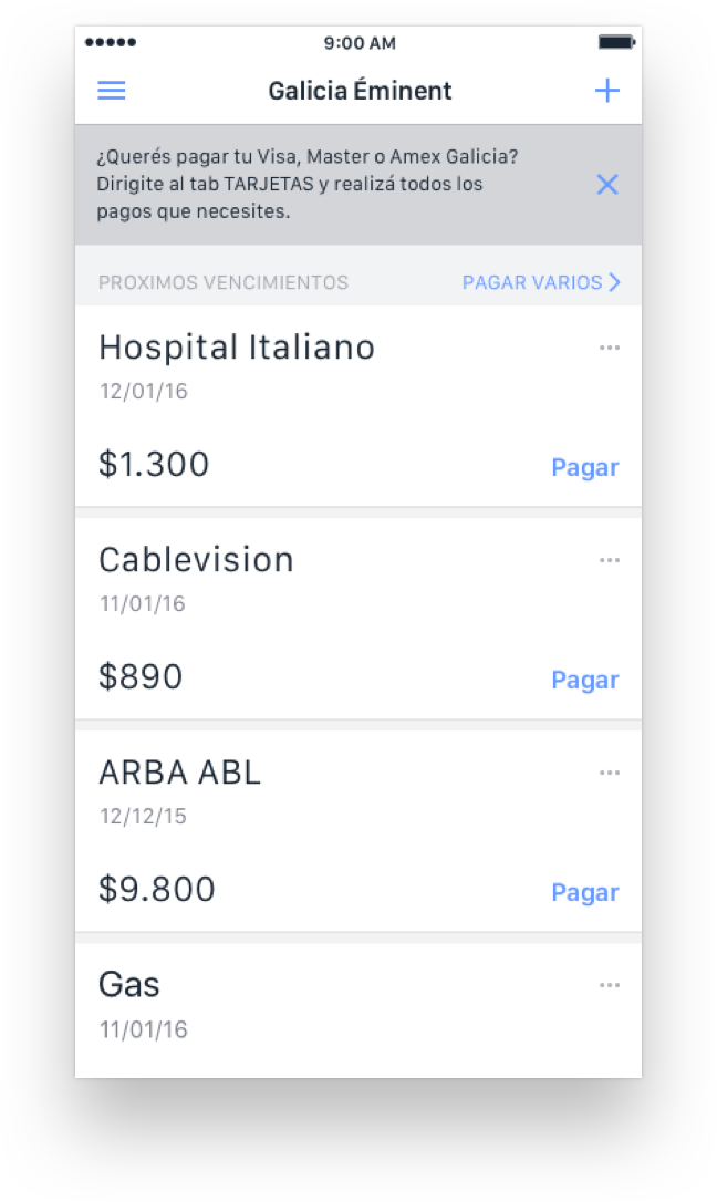
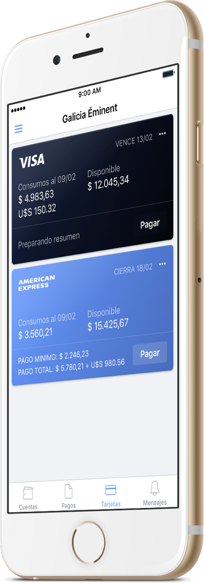
The original flow had a series of different screens for each of the main actions within the platform. What we did was group those actions by stages, resulting in a much simpler, smoother experience.
As always, we moved from research to paper. This quick, cheap way of testing and iterating ideas allowed us to try different approaches early, making sure we explored all possible alternatives. Once we defined a clear navigation paradigm, we moved on to lo-fi wireframes.
We got to work on defining the narrative and the different hierarchies that would eventually make up our Online Banking.
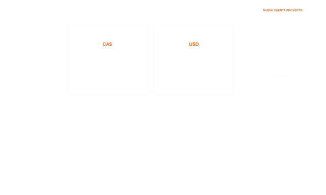


Consistency is one of the most challenging aspects of working with an ecosystem as large as this. Here are some of the visual elements we included in the platform:
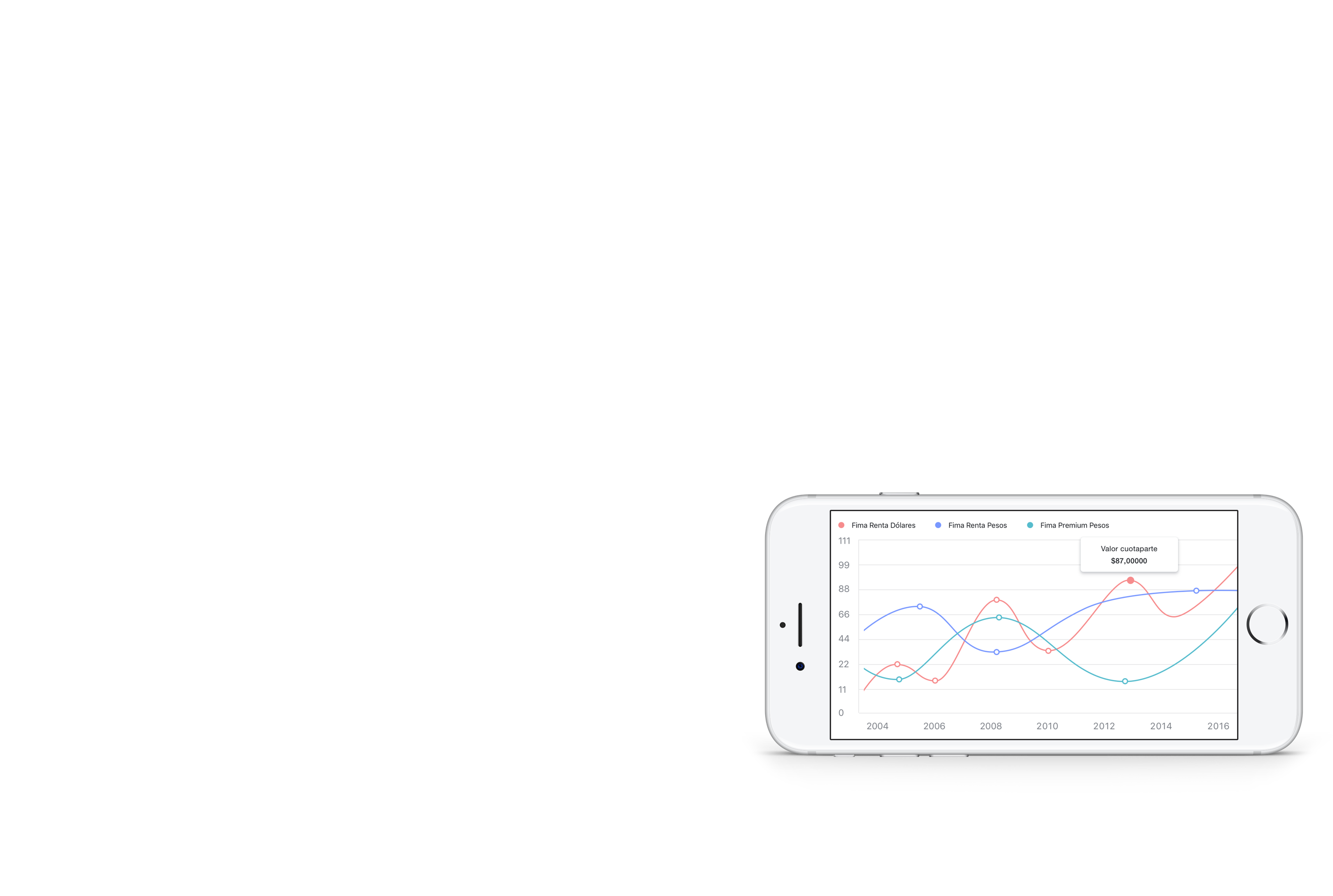
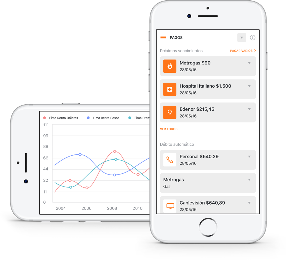
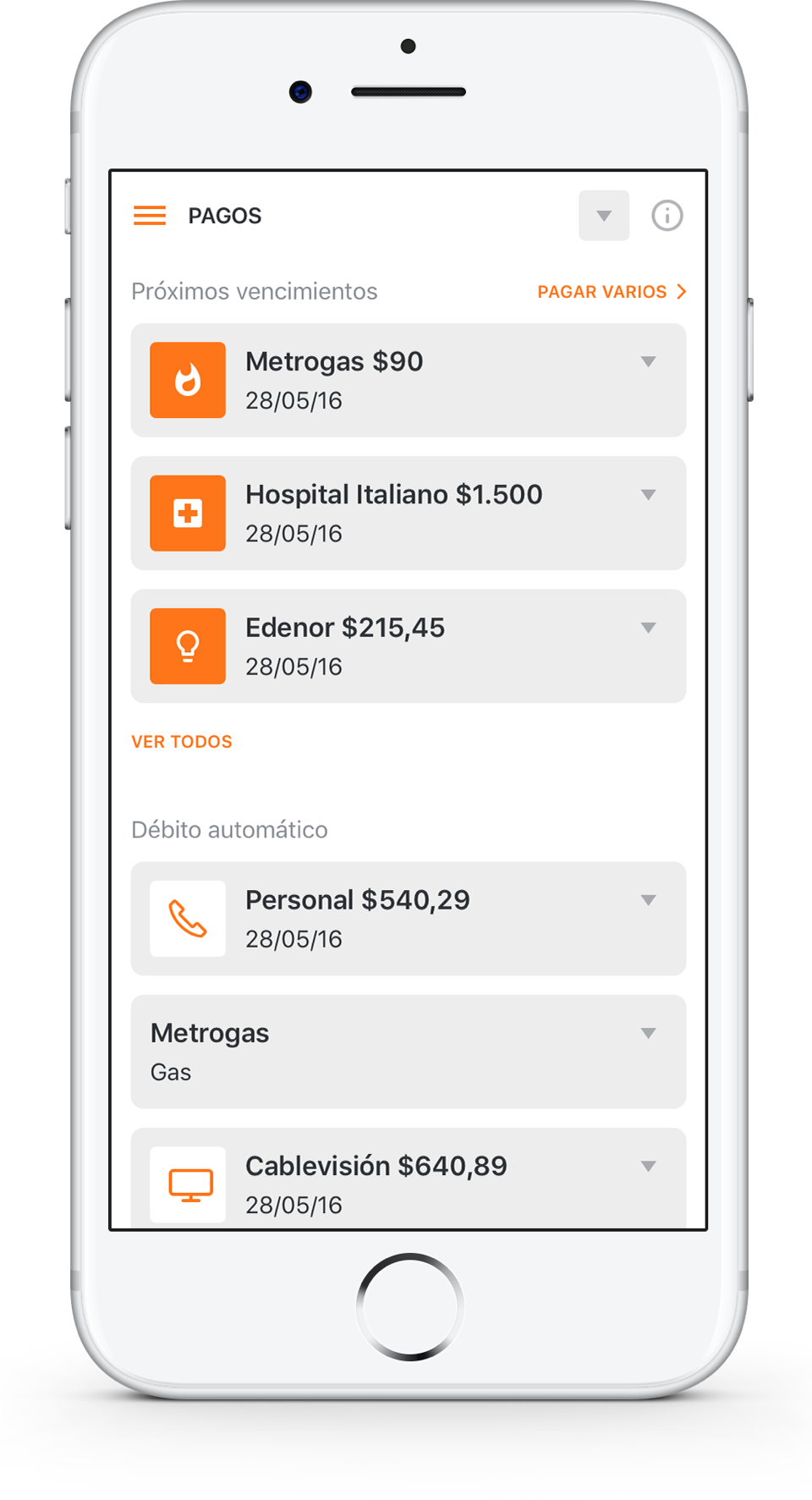
From account balances to investment opportunities and all the way to payments made, this project involved thinking a broad range of solutions for an even broader range of users.
Galicia’s premium service demanded a cleaner, more elegant look.
As a product for younger users, Move needed to have a distinct identity while staying consistent with the original visual system.
Galicia’s premium service demanded a cleaner, more elegant look.
As a product for younger users, Move needed to have a distinct identity while staying consistent with the original visual system.